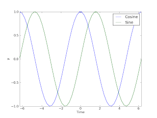
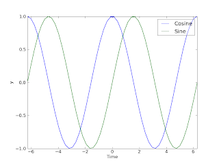
- Create an image file from your plot and then "photoshop" it (or gimp it...)
- Add the alpha channel directly in the plotting tool...

from pylab import * t = linspace(-2*pi,2*pi) y1=cos(t); y2=sin(t); plot(t,y1,label='Cosine') plot(t,y2,label='Sine') xlabel('Time') ylabel('y')
axis([-2*pi,2*pi,-1,1])
leg=legend()
savefig('namehere.png')
close()
Now we see from the resulting plot that the legend covers some of the graph. Now, before the "savefig" command, add the following:

frame=leg.get_frame()
frame.set_alpha(0.4)
The resulting plot is shown below the original. Better, don't you think? :-)
PS! Click on the plots to show larger versions!

ReplyDeleteNice blog. Thanks for sharing such great information.Develop xamarin application Hire xamarin developer